Web, native … now invisible?

What question are you more likely to answer: “Your best friend’s Birthday is coming, what present are you going to get her?” or “Today is Erica’s Birthday, would you like to gift her a bar of chocolate?”
Perhaps you’ll be already on your way to order her some sweets.
People tend to get lost when they’re offered to choose. And if there’s an option and the only thing you should do is to say YES or NO, things get much simplier.
Perhaps you’ve already interacted with invisible apps but didn’t realise that in fact.
Did you know that average time of transient attention when we use mobile apps is only 8 seconds, while focused is less than 5 minutes? Every year we spend 21% more time on mobile apps, BUT…
20% of apps installed are opened only … once!*
* stats by thenextweb.com
The average time spent on app is 103 seconds. A lot? A little? Enough?
Well, while development companies struggle for creating the top app, the mobile app market grows with invisible apps, those that we don’t interact with, but really enjoy and can’t imagine how we coped without them.
If we are talking about mobile apps, in this article we’re going to reveal what does it mean for mobile app to be invisible and how they actually work.
They know what you want

The core concept of the invisible app is to сut the number of actions the user has to do. A simple example could be Google Now which notifies the user with time he has to leave for another appointment in order not to be late. So it has already learnt your calendar, location, timing and traffic and estimated your average time to get to the place. Feel the idea? It operates in the background, it does things you don’t ask it to do, but provides with precise and relevant info you find useful.
That’s in short.
And now let’s compare just 2 notifications: “You’re having yoga class in an hour” and “You should leave the party in 30 mins to get to your yoga class on time”
It’s obvious the second helps you avoid extra work.
An obvious benefit for developers is that such apps are code-performed and do not demand any UI/UX since users don’t interact with them directly. You can develop a web page or build an ordinary app to perform the results there (as Digit does).
The DIGIT’s CEO Ethan Bloch has once noted that they decided to go invisible just because it was much simpler: you don’t need to develop the whole app.
Now let’s see how it works from technical point of view:
As we’ve previously mentioned, invisibles run in the background. They interact with other services you use in order to identify your location, preferences, gather info about people you communicate with (via Google calendar) etc. So again, before Google Now says you have to leave in 15 mins for your next appointment, it would have already gathered info from all possible sources to provide you with the most precise data.
They access this data via sensors on your smartphone. Both Android and iOS provide developers with special APIs to get this data. But the documentation and the variety of these APIs is GREAT! That makes it difficult for developers to select the appropriate one and learn how it works. There are 5 Android APIs only for location!
The Best Invisibles Overview
DIGIT
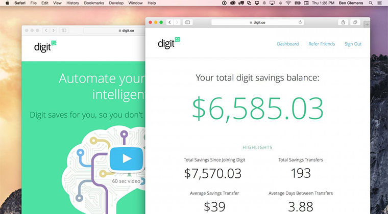
Another example of invisible apps is Digit. Which is a newborn banking startup that helps its users save money. How?
The logic is the following:
The day you connect Digit to your account it accesses data on your transactions and in a week or so it will start making small transactions to your Digit savings account. The amount of these transactions will be based on your balance and it does its best to make the process as much unnoticeable as possible. As a result the user saves a sum of money without any constraints and inconveniences.
The amount you’ve saved can be withdrawn any time and you can refill the balance by $5 by inviting a friend to install the app. Positive users feedbacks mean that Digit really works: some have saved several dollars, some up to several hundred dollars!
UBER
Let’s first congratulate the guys with their recent $1,2 billion investment for expansion to 100 cities in China.
Well, we bet 80% of those who read this article have already tried it. The app works as a taxi service and doesn’t just call you a taxi, but shows in real time the car’s location, time the driver will reach you and notifies in advance the time you have to leave to get in the car. The service also explores your previous experience and preferences so that you are offered the appropriate class or the car.
The guys have also developed a convenient payment process (users don’t have to put their payment details) so that it charges you via credit card. If you like the check – there’s already one in your inbox.
Cloe
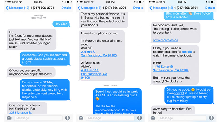
Another invisible story is Cloe. Something like Siri, but smarter. That’s currently only for those from NY and SF, but this can’t limit its amazingness. Many even joke that it’s a nice option for some “Mr. Lonely”.
The app performs as a chat. Chat with a friend. The only thing you should do is to take the initiative and send a message asking for advice. You’ll shortly get a recommendation. “The more you’re communicating with her, the more she’s going to know. It’s like, Hey! I know you don’t really prefer the fancy grilled cheese sandwich on pumpernickel. You prefer more of the American classic throwback that your mom used to make.”, as Cloe co-founder Chase Hildebrand explains. Therefore, instead of pointing you to a fancy grilled-cheese food truck, Cloe might point the way to the nearest diner.
The Pros And Cons
Now when you clearly understand what invisibles are about, let’s discuss the pros and cons.
- No app updates
Because they are not apps as we normally get them. You can focus on delivering high quality product without the need to constantly puzzle your users with installing updates.
- Forget the UI/UX. Can you just imagine how much workload you can avoid?
Again, since they’re not traditional apps. No interaction with user means no necessity for UI/UX.
- No logins, passwords etc.
Remember that 21% of apps installed are opened only once? Would you like to be one of them? Invisible is a nice way to become a friend of your user. Save their time and efforts, no one enjoys to login.
- Users get addicted to their friend-apps
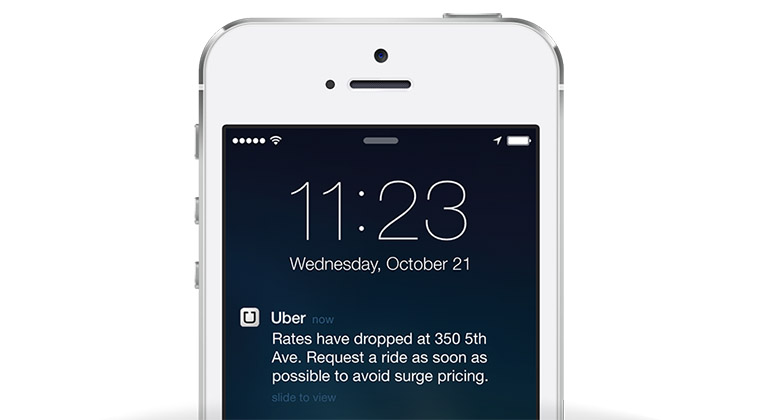
And finally that’s the most sweet and attractive part for those looking to develop an invisible. First, because you appear as a text message on the screen and communicate with user like a friend. Not a business app. Message is not a notification and means a lot for a user.
Why they are still not here?
- Privacy
Paying your taxi is convenient but have you thought that the app has all the info about your credit card? So that’s the first challenge developers of invisibles face: work with privacy. Now many users hesitate to trust the apps this info since there’s no detailed encryption process described and how this info will be treated.
- Batteries get tired fast
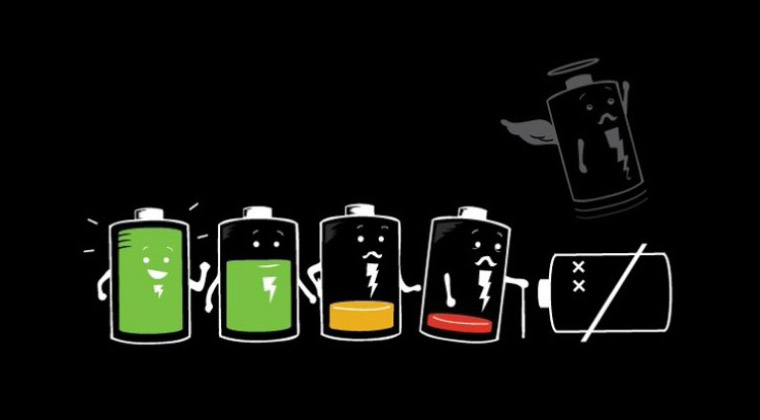
How often do you use any location service? Have you noticed how fast your battery “gets tired”? Since invisibles operate via sensors on your phone and permanently run in the background, the batteries need to be optimized first.
- API mess
As we’ve already told, in order to develop any invisible app, developers will need to learn a GREAT amount of documentation. iOS and Android both offer dozens of them, but they do need review before invisibles expand.
The future when your phone knows what you want before you even ask is just round the corner. But before this significant trend comes to life, a lot of changes have to take place. Technical, privacy, community hurdles must be bridged over and after the first privacy-friendly and battery-saving app will be released, the market will just boom with such products!
Anyway now you’re ready after reading this article. Right now we’d like to support the conversation on mobile by sharing our recent whitepaper on “Mobile App vs Mobile Web” which is ready to download.


