Do you remember to have recently gathered together with your friends for a dinner in some fine restaurant that was not interrupted by numerous calls or alerts? That could be possible 10 or 15 years ago, right? We do not even talk about how many people are being offended by their opponents paying attention to their iPhone instead of their friend.
The reality is that we can’t actually live without smartphones. Through the last decade they have turned our habits and lifestyle upside down. So the recent release of smartwatches is expected to bring comfort and ease to our tensive lifes. And the only thing we should do – switch to completely another approach of design. Since design means solving problems. And in order to solve users’ problems it should be simple, intuitive and effective.
Avoid distraction

The core problem is that we treat our smartphones as small versions of our PCs. We use them for business purposes, chatting via social networks, shopping, ordering taxi, playing Candy Crush and many more. But have you ever thought how they make us put all the issues aside and see who has sent you an email or check some latest app’s update?
Let’s just compare the two different situations:
I.
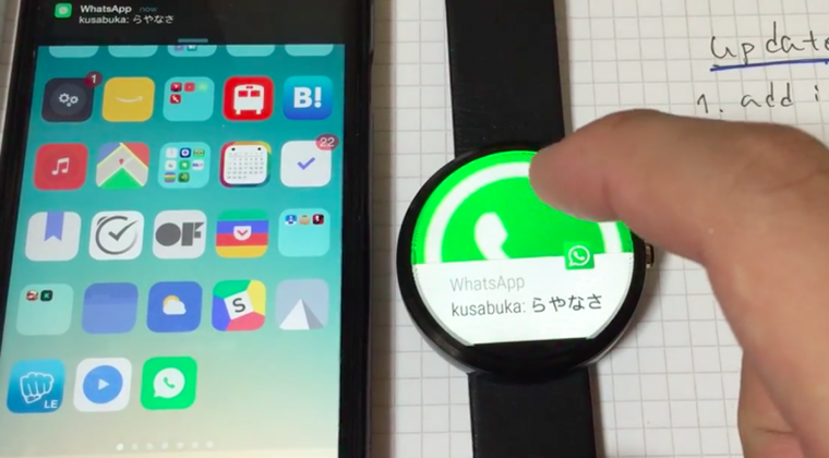
You’re in a meeting and hear your phone vibrating inside your bag. So you’re more likely to check if you’ve missed something important. Laying in your pocket/bag/on the table and vibrating every time the new alert appears, in 99% of cases you’ll fail to ignore that. The same time it’s impossible to put a glance at your smartphone and stay engaged in the dialogue. As a result you interrupt the conversation and pay 100% to the phone. Though recent versions of OS do their best to provide us with tools to reduce the frequency alerts appear and allow to give priority to some calls or emails, they should improve.
II.
You’re in a meeting and notice that your watch alerts. You’ll need a moment to understand what happened without interrupting the meeting. You can even leave your phone in the bag or in the pocket and be sure not to miss a call from your boss for example.
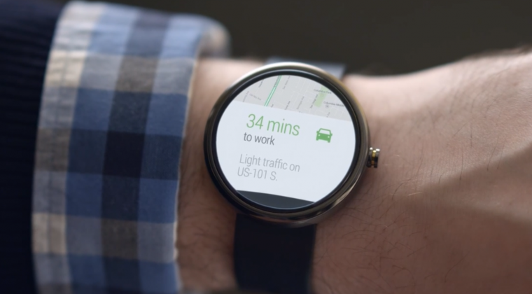
Once you feel your smartwatch vibrates, the only thing you should do is to turn your wrist a bit and you’ll immediately see what’s there.
So the main purpose of smartwatch is not only boasting, but also making our lives easier just like the rest of the devices surrounding us.
But remember that when you’re going to distract the users, the alert should be of a very high quality. Give users an opportunity to control and change the types of alerts at their convenience.
Apps on smartphones don’t solve problems when you’re on the move.

Since the purpose of everything we buy and use is solving problems, the invention of smartwatches was not occasional.
We bet you have experienced an unforgettable excitement after buying a brand new smartphone: so many apps to try, so many useful functions that are new to you! But with the time you’re getting used to them and sometimes another distraction may even annoy you.
![]()
Just imagine an app that is your invisible assistant: identifies your location, alerts once you’re late for the meeting or messed up the floor, or suggest some place for dinner. You can rely on it any time you need navigation in some unfamiliar city. The app can also help you purchase online or notify if there are any special offers in your favourite shop. So just like the invisible apps we have discussed before.
But smartphones, again, demand your attention: make additional movement to read the alert, be careful not to drop the phone and respond to it. Smartwatches oppositely save you time.
They do not demand a lot of interaction with the user, the major part of work they do themselves in the background and the only thing the user has to do – make a decision.
So that is the main purpose of a smartwatch: make your life easier and free time for you. How to do that?
Design for users and keep in mind their feelings and understand their emotions
There is a theory that we could replicate about 60% of PC functionality on a smartphone, and another 20% of that on a smartwatch.
But for smartwatch design you’re pretty limited. The size of the screen is uncommon and extremely small. It’s a great proficiency check for any UI specialist since they have to put all the necessary stuff on the app, organize it there wisely and not overload the screen for the user. A challenging task, isn’t it?
Let’s see what are the core points you should remember for creating effective smartwatch app:
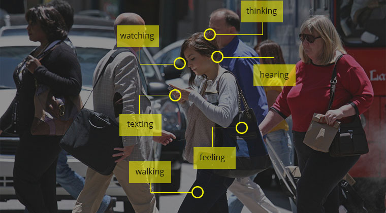
- Imagine and try to understand what the users are more likely to do in this or that situation. In order to provide an outstanding experience keep in mind the variety of feelings and senses a user has. For example doing a roman chair exercise in a gym you have to check you perform the exercise right, keep an eye on your pressure and the same time you hear music and all the noise around you.
The same with smartwatches: when a person uses them, there’re plenty of issues around so that the design of your app should be simple and emphasize the main functions the users might wish to enable.
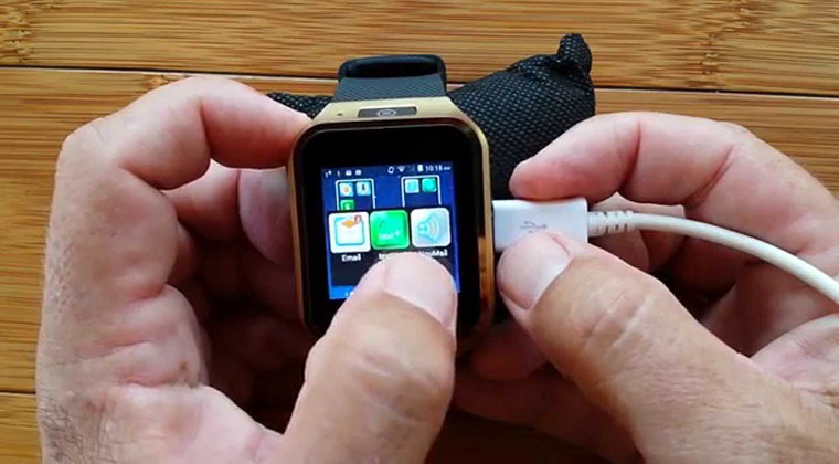
- Another core difference is the way people interact with smartwatches. Reading from smartphone screen is easy, because the font is bigger, images are larger … But things work differently with smartwatches. The user has to understand quickly the message or alert just by having a glance at them. So designing a smartwatch app lets the user spend as less time as possible to get what they wanted.
For successful design the main question you should constantly ask yourself is:
What the user is going to do via the app when he’s moving or resting?
According to your answer adjust the screens for the most convenient usage.
- After you have completed the development it’s vital to test the app. The best option would be to move away from your office to the most realistic conditions: in the street, public transport, home.

To Sum Up
The smaller the screen the more minimal the interface should be. Use minimum elements and as few screens as possible. Our main mistake is that we think wearables are just a smaller version of another gadgets: phones, tablets etc. But that’s wrong. Users take them as an accessory wearing on a wrist, so the approach should be appropriate.
Without apps, users won’t buy wearables. But they do, so do you best not to miss the opportunity to deliver one of their favorite apps!
It impossible to create a smartwatch app without thinking of a user’s behavior. So the best and the most reliable approach is to get into your user’s shoes and you’ll deliver an unforgettable user experience!


